Proportions
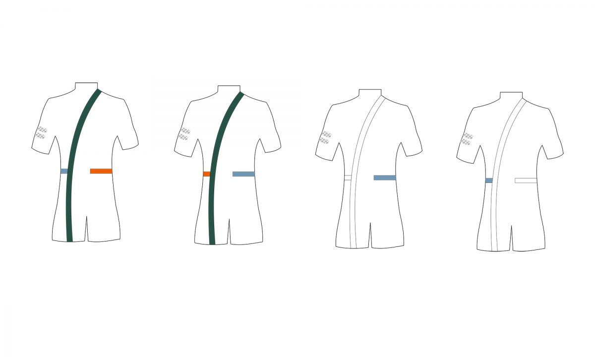
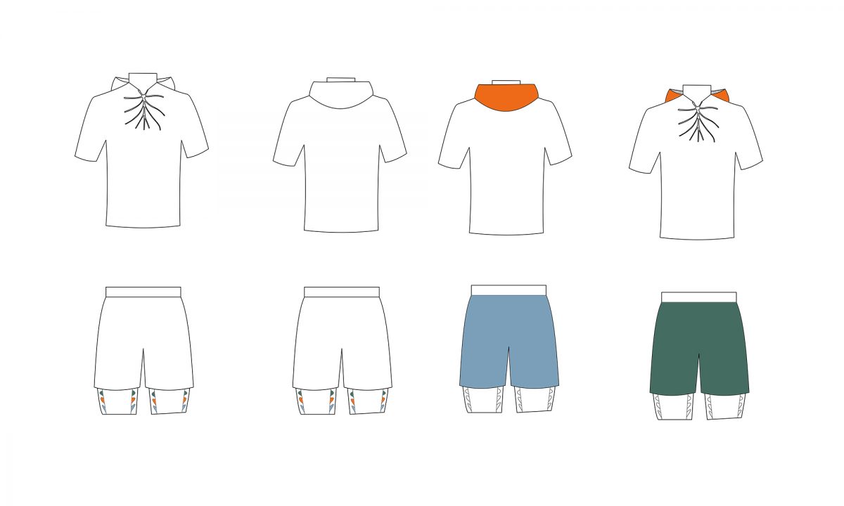
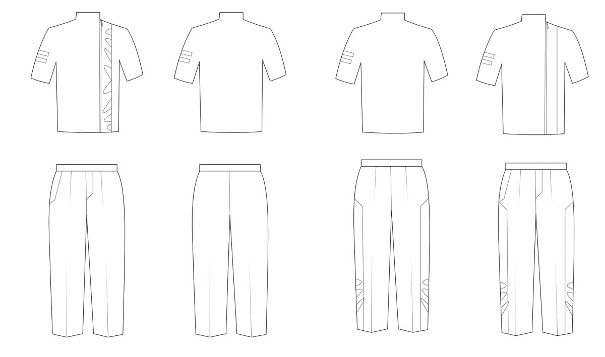
When creating the range plans for the whole tennis collection I had to keep two rules in mind – it has to incorporate the three main court colors, and it has to reflect the range plans for the womenswear collection. Starting from these key points, I slowly developed a range plan in accordance with the four tournaments’ rules and based on playing with textures and color proportions to achieve different intensity and slightly different palette ratio.
It allows all of the garments to keep the essentially clean line of the collection, while still offering variety and making different combinations possible.
The Australian Open range plan provides two polar views on the two-piece outfit. Much as the first option counts purely on discrete color proportions to turn the attention to the shape, the second one stands out with a playful design, relying upon the difference between the front and back color schemes.
Looking at the French Open range plan, it is amazing to observe how the change of two key trims can completely alter the whole look of a garment. Here, again, the customers can choose between having the whole palette coloring their outfits, or just a subtle light blue, creating an extremely clean look.
For the Wimbledon range, the lack of color turned out to be rather an advantage than a disadvantage, as I thought at the beginning. This allowed me to look at the garment in solely a structural way, which lead to an interesting design decision. The laser-cut elements, representing the leaf print, move between the top and the bottom part, creating different proportions.